Last Updated on:
SpaceInvader has completed the interior design for the first European hotel under the new Four Points Express by Sheraton brand, located in Euston, London. The project involved designing all guest rooms, public spaces, and food and beverage areas, as well as the hotel’s wayfinding system. The 211-room property represents Splendid Hospitality’s first collaboration with Marriott International, after a £50 million investment alongside co-developers Assured CMS and Dean Street Developments.
Brand Identity:
Positioned within the midscale segment, Four Points Express by Sheraton caters to value-conscious travellers seeking a hassle-free stay in a convenient central location. The hotel, located in the former The County Hotel on Upper Woburn Place in Bloomsbury, is just 500 metres from Euston Station and within a kilometre of Kings Cross and St Pancras International. It offers modern, cosy rooms, drawing on nature-inspired themes with a botanical colour scheme, taking inspiration from nearby parks and Georgian architecture. The hotel also includes a lively restaurant, bar, and an on-site Caffé Nero for quick meet-ups or remote work.
Marriott International created this new brand in response to rising demand for affordable yet dependable accommodation across Europe, the Middle East, and Africa. This announcement follows the company’s expansion into the midscale market with City Express by Marriott in Latin America and its plans to introduce StudioRes in North America.
SpaceInvader’s Work in the Hospitality Sector:
This project with Marriott is part of SpaceInvader’s growing involvement in the hospitality sector, which includes hotel projects with Hilton, Radisson, and Accor. The agency is currently working on projects in major European cities such as London, Berlin, and Valletta. Its portfolio also features boutique hotels in heritage sites, including Wildes Hotel in Chester and Oddfellows on the Park in Cheadle, as well as several food and beverage projects like BLOK at Lanelay Hall in South Wales.
“Hospitality is an exciting sector for us,” commented John Williams, Founder and Director of SpaceInvader. “From refurbishing historic buildings to revitalising existing hotels, we bring a focus on creating rich, people-centred experiences. Our design approach has earned us over 60 creative award nominations in the last ten years.”
Design Concept and Execution:
The former County Hotel underwent a complete transformation led by Glasgow-based Maith Design, who expanded the original 8-storey structure and opened up the ground floor to create a more spacious layout. SpaceInvader’s initial commission focused on guest room design but was later expanded to cover the entire 3,926 sq m of the hotel’s interior spaces.
The hotel now includes a lower ground floor with guest rooms, cloakrooms, and back-of-house areas, while the ground floor contains the reception, bar, restaurant, a private dining/meeting room, and kitchen. The remaining guest rooms are spread over the first to seventh floors.
SpaceInvader Associate Imogen Woodage explained: “We drew much of our inspiration from the Bloomsbury location, particularly the elegant Georgian architecture of Woburn Walk, with its black-and-white façades and wrought iron balconies. We brought these design cues into the interiors with panelling, dado rails, and fabrics that reflect the linear patterns of Georgian style.”
A secondary influence came from the local parks, adding a botanical theme to the design, with green and blue accents, botanical-patterned wallpaper, and generous planting throughout. The third inspiration was the novelist Charles Dickens, who lived nearby and was known to frequent Woburn Walk.
“Dickens’ approach to publishing his stories in instalments, making them more accessible to a wider audience, resonated with the hotel’s goal of offering reliable, affordable accommodation. His pet raven, Grip, inspired the name of the hotel’s restaurant, Raven, and is reflected in the bird-themed décor,” Woodage concluded.
Design Walk-Through:
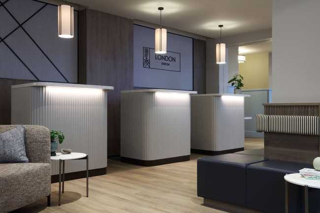
ReceptionThree informal reception pods, with a vertical fluting detail – made of bendy ply to create the shape with solid timber slats to dress the outside face – greet visitors on arrival in the reception area and introduce a vertical design treatment which links to the linear fabrics elsewhere in the scheme. The informality of the pods is also partly aimed at encouraging general public usage of the adjoining bar area.
Four Point Express by Sheraton’s signature brand patterns are introduced as soon as people enter the space, with the new dynamic pattern applied to the reception wall alongside the locality sign. This geometric, diagonal-line iconography also sits alongside SpaceInvader’s wayfinding in the hotel’s corridors. Framed artwork throughout, in the form of historic black and white photography of the local area, overlaid with the brand’s muted colour palette, was selected and provided by Spires Art.
A dado rail also features throughout the public spaces, running around the reception space and reception bar area, with the bottom half of the wall painted pale blue (taken from the corporate brand palette, though in a more muted tone) with neutral cream above – reflecting the Woburn Walk inspiration taken from the locality.
Bar & Glazed Link Area Two lounge seating set-ups are located directly opposite the reception pods, with additional perch seating arranged around a circular central column. The Caffe Nero area is to the right of reception, whilst a 12-cover curved bar over to the left has a green laminate and aged brass-coloured metal tile front, echoing the shape of a bird’s wings, plus a stone counter, with bar seating alongside and pendant lighting above.
To the top left of this series of flowing spaces is the new extension area leading to the restaurant, which features low-level, rounded-edge banquette sofas in four facing sets. These are joinery pieces specially-made for the project and feature timber for the external surrounds, main structure and legs, plus upholstered seat backs in a blue velvet sourced from Sunbury, faux leather seat pads and textured fabric soft cushions. Artwork on the wall to one side is faced by mirrors with radius corners on the other to reflect light and create interesting glimpses and vistas for guests using the bar.
The banquette booths offer some privacy in this circulation/connecting area for those who wish to be more sealed off, whilst a continuous, right-angled counter with high seating is situated alongside the glazed windows – featuring a crittal-style grid treatment – so that people can also face outwards onto Woburn Walk. Vertical grid tiling clads the remainder of the wall below the window. This area also features Amtico patterned LVT floor tiling, adjoining a timber flooring section for the booth seating, as well as a half-height wall finish, planting and delicate pendant lights (Matt Opal glass with brushed brass from Chelsom Lighting) over the window area – the same light as used over the adjacent bar counter.
RestaurantEntry into Raven, the 66-cover restaurant named in honour of Charles Dickens’ pet raven, is either directly from the main entrance or via the bar area. To the restaurant’s rear is a long buffet counter for breakfast, located directly adjacent to the kitchen. The hot counters are to the left and cold to the right, with optional heating underneath. A third iteration of the Amtico patterned tiled flooring runs the length of the counter approach area and continues up the short stair that leads to the kitchen and private dining area. Nine pendant lights are also arranged over the buffet – the Penny Bronze light with Oyster Fabric from Chelsom Lighting.In terms of seating arrangement, there needed to be a mix of fixed covers and smaller tables for flexibility, able to be grouped together or to stand apart. A central row of tables is arranged at 90 degrees to the others to break up any feeling of uniformity. Existing nooks are used for booth seating, with one at the rear, adjoining the buffet counter, set behind a protective outer timber shell. The banquettes are upholstered in green velvet with faux leather seat pads. Other seating features green fabric upholstery also, with rattan backs. There are four different types of freestanding chairs overall to give the restaurant a boutique feel, with backs either in rattan or upholstered in a flecked material or, once again, a linear, Georgian-style fabric.
The ceiling grids had existing beams which had to be rebuilt during the redesign. Three new grids now reflect the seating layout below, with acoustic panels incorporated and featuring Georgian-style beading, including a radius edge. Inset LED lights feature lap the perimeter edge of each grid.
The restaurant’s tabletops are all in laminate with some featuring reverse bevel edges. Stacking wall tiles above the buffet counter are another aspect of the linear symmetrical element of the scheme. Crittal bi-folding doors with glazing above announce the private dining area, located up the same small stair that leads to the kitchen. The doors to the private dining space can also be fully opened for breakfast overspill during peak busy times and used as a bookable meeting space when needed. Inside, a ten-person table and chairs are arranged on a raised platform. The interior features a soft colour palette with textured wallpaper, whilst a central pendant light – the Opal White from Muuto – hangs over the table. An inset carpet by Ege beneath the table grounds the furniture arrangement.
Lift lobbies and Corridors
Working with the existing space meant corridor ceilings at a 2.2m height, so that the design for the hotel’s corridors and doors had to be very simple and unfussy. The corridors feature a carpet by Ege offering a sense of movement and linearity, whilst a simple elevation is created by dark grey skirting boards and architraves. In the lift lobby, the brand graphic is a signature item applied a large scale in the brand’s tonal blue, with wayfinding signage in sprayed acrylic. Bedroom doors are kept simple with softly-illuminated room numbers in a stacked style to elevate.
Guest and public cloakrooms are included on the lower ground floor for bar and restaurant users, with a male, female and accessible toilet. The treatment for all three is a monochrome tiled floor with stripe effect wall tiles. Vanity units are in grey stone with radius-edge mirrors and rounded edge wall lights above.
Rooms
Bedroom doors are made up of simple laminate panels with room numbers in a stacked style to elevate the look and feel.
The room concept features a stripped back monochrome palette with botanical feature areas and Georgian inspiration for the detailing, including a black and white linear fabric for the headboards, dark grey skirting boards and mouldings framing the mirror and wall hooks. As the rooms are compact, a laptop tray is provided instead of a desk, although there is also a welcome shelf visible on entry, providing tea and coffee, which can also double up as a small desk and which has a foldable stool hanging directly beneath. A further space-saving storage solution is a carved-out under-bed storage area. The colour scheme for the rooms is made up of soft tones to enhance a feeling of space and calm.
Old-fashioned dials are used for the safe unit and the toilets feature grey freestanding vanity units and black accent accessories, working with the dark architraves. Beds are varied in location, with some at 90-degree angles to others, with wallpaper and textured surrounds to ensure the rooms feel warm and more homely. A dado rail with an LED light also creates a cosy nook effect around the bed. The paint finish above the wallpaper continues up to the ceiling to enhance the space and create continuity. Cushions are in a yellow from the brand colourway, but lighter tones once again, with the colour yellow also featuring as a muted overlay on the local photography artwork, the hanging stool and wall hooks, arranged in the same dynamic pattern seen behind main reception, but at a much smaller scale.


